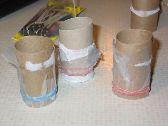
Today, the kids and I made some candles. This is something that I did once as a kid, possibly after reading about it in the McCall's Make-it Book or some kids' magazine. I melted wax and added crayons and them filled a tin can. Getting the can off was a bear. So this time, I'm an adult and proceed a little more thoughtfully. First, I got wicks at a Michaels store like six months ago -- I've been meaning to do this for a while. I knew that we'd need molds of some kind so I decided that trimmed toilet-paper rolls would be perfect for the three inch wicks that I had. Needing something on the bottom, Cathy suggested plastic-wrap. It worked!
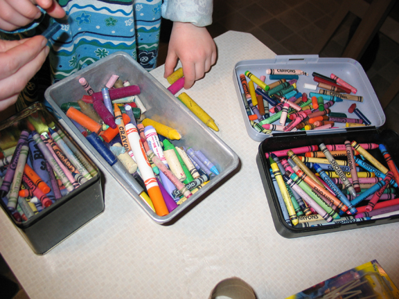
Once the kids caught wind that I was thinking about candles, they were very interested in participating. So we got our respective crayon collections together and isolated a bunch of broken crayons that we could use. Just pawing through the crayons is kind of fun. :) Of course there had to be a little friction between Garrett and Kivi, but it wasn't bad.
Our execution of this project was pretty haphazard. I decided on the cardboard tubes long before figuring out what should go below. Cathy suggested the plastic-wrap and once it was rubber-banded in place, it was pretty good. Some wax did seep up under the bottom of each and was a hassle to trim up, but not bad. We melted the wax in star-shaped foil cupcake cups that were left over from Kivi's birthday. Half way through the project, Kivi decided she didn't want a pillar, she wanted to just make a star-shaped candle, so that's what we did for one of them.
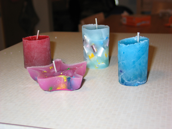
Here are our four candles. Each one is different. The red one is the first one and had some red, gold and metallic red crayon in it. It's also the one that seeped out the bottom the most which accounts for the funny top shape. The blue one was Garrett's and the second one we did. He included blue and green crayons and they are quite evident when you look at the bottom of the candle. As mentioned, Kivi's candle is the star, which was our third. The bottom of that one is really nice -- deep colors and slick and shiny as glass. In response to our difficulty getting the crayons to melt enough that they were merging with the wax, but not so much that they just dispersed into it, I tried something different with the last one. I broke up a bunch of crayon scraps and layered them into the tall mold with the wick in place. Then, I dumped some wax that happened to have a bit of blue pigment from a previous melting in it all over the crayon pieces and filling up the tube. It's neat, but I wish the pieces had melted more.
Showing posts with label craft. Show all posts
02 February 2008
Watercolored Paper
Right, so last night, I made up a batch of watercolor-tinted paper for collage and further paper-making projects. This idea stemmed from some accidental bleed-through that I got with watercolor markers on coffee filters and office paper and was reinforced by a section in Collage Unleashed by Traci Bautista that I ran across. All I used for this was household paper towels, Zig watercolor brush-markers and water. (Please note that using watercolor markers is probably the dumbest and most expensive way to do this -- squeezing a bit of tube watercolor -- though just a tiny bit, or painting from dry blocks would be more reasonable, but I was in a hurry...) Here's how I did it:
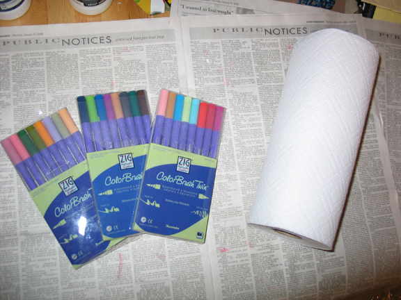
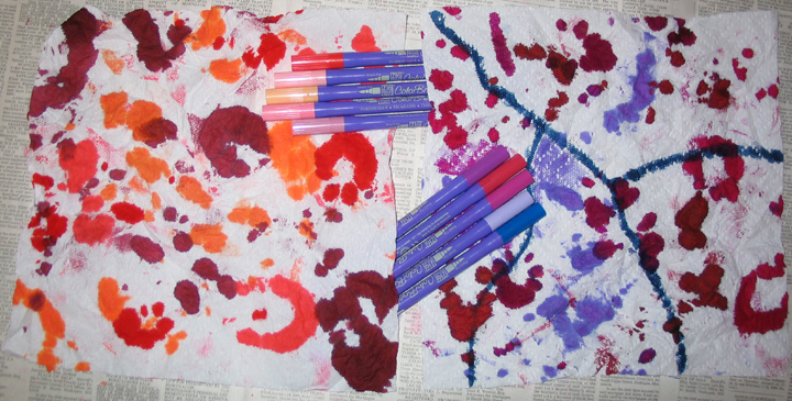
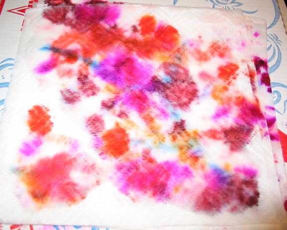
1) I allowed the watercolors to soak out of the brush-tips semi-randomly by wrapping the paper around and around the brush-tip and letting it sit with a weight (a bottle of gesso) on it for a few seconds or so. The towel paper is pretty efficient at sucking the pigment out of the pen so you don't want to leave it too long. You can see that I also added a blue line to one of the two sheets in a much more intentional effort. Also, for the two sheets that I worked on, I selected different pallets of pigment to use and the pens I chose for each are shown here with the "finished" sheets.
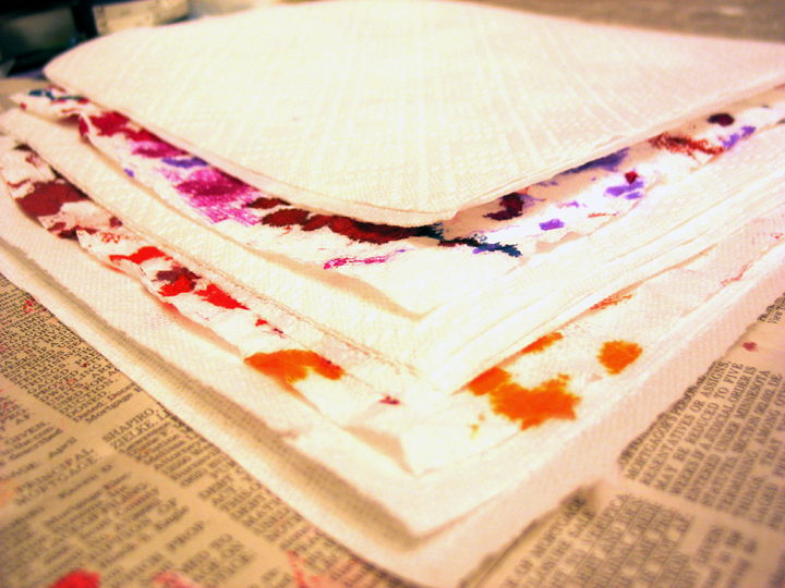
Once the pages were inked up, I wanted to transfer the pigment from sheet to sheet, spread it around on the sheets that I inked and also increase the number of sheets that I had to work with. There were places where the pigment was so heavy that it was obviously wet to the touch. To make this happen, I stacked two clean sheets of paper towel at the bottom, then one of the colored sheets, then three clean sheets, then the other colored sheet and finally two clean sheets at the top. Based on the results that you'll see below, I wish I'd placed more clean sheets, especially between the two.
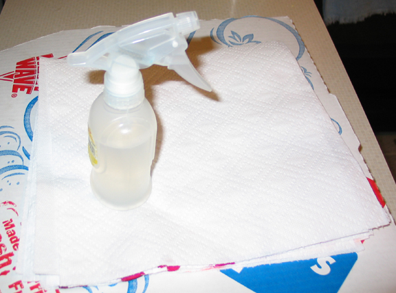
At this point I moved from my paper-craft table downstairs to the kitchen counter upstairs since I'd be using water and leaving my work to dry under a ceiling fan. I wasn't sure about how (or how much) to wet the stack of towels but I was pretty sure that I didn't want to just run them under the faucet. I opted for a spray-bottle as the applicator. (And a pizza box to protect the counter -- but I should have put down newsprint instead of being lazy, now we have a bit of pink to our counter.)
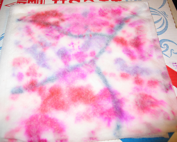
I started out gingerly spritzing water onto the top. But a stack of nine paper towels is pretty absorbent and after going crazy with the sprayer for a while I discovered by pulling up a few sheets to look for saturation that it was all kind of floating at the top of the stack. This is what the top looked like after I was done with just spritzing the water. The problem with deciding that it needs more water is that the water-storage capacity of modern paper towels is astounding. Maybe I should have sprayed a bit on each towel as I layed them on the stack or something.
I ended up taking the lid of the sprayer and just pouring water onto the stack. And I got quite a bit too much, I think. I noted above that I wished I'd included more clean towels; that might still be good, but really, I should have used less water. Next time I'll pour it on more gradually and let it soak in before pouring the next bit on and try to reach a saturation without a soak. This is what the top looked like after I was done applying water.
So, once I had the stack soaking, I still noted that the migration of the pigments through the substrate was pretty minimal. And while there were some nice color combination blotchy areas, there was a bunch of plain white paper towel. As skeptical as one might be of using paper towels as an art medium anyway, plain white even makes me cringe. So I rolled the whole stack up thinking I could just knead the colors around -- which turned out to be correct.
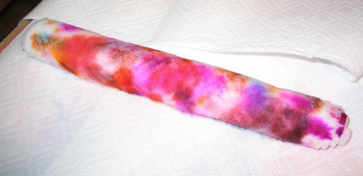
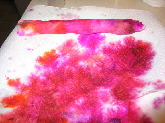
The problem with kneading the colors around, at least in part, is that there was all that water trapped in the paper. When I squeezed, huge gushes of water would spill from the roll, carrying the pigment with it. You can see the mess that it was making below (but y'know, at least a mess of nicely colored paper towels is something I can use) where I was working. The real problem with all this water flow becomes evident when you note that after this step there is much less in the way of discrete color blotches. They've all bled together. Which is fine, but kind of less pretty than, especially, that first shot I took of the roll before I started squeezing. Again, less water next time.
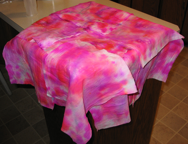
So, after wringing the roll of towels out a bit, I unrolled them and picked them apart to spread and dry. All of the above-depicted work was done in half an hour on the evening of 01 Feb 2008 but these last two shots and some final drying are from the early morning of 02 Feb. You can see what I mean about the blotches bleeding together. I'm still not totally complaining about the effect, but more discrete colors might be nice too.
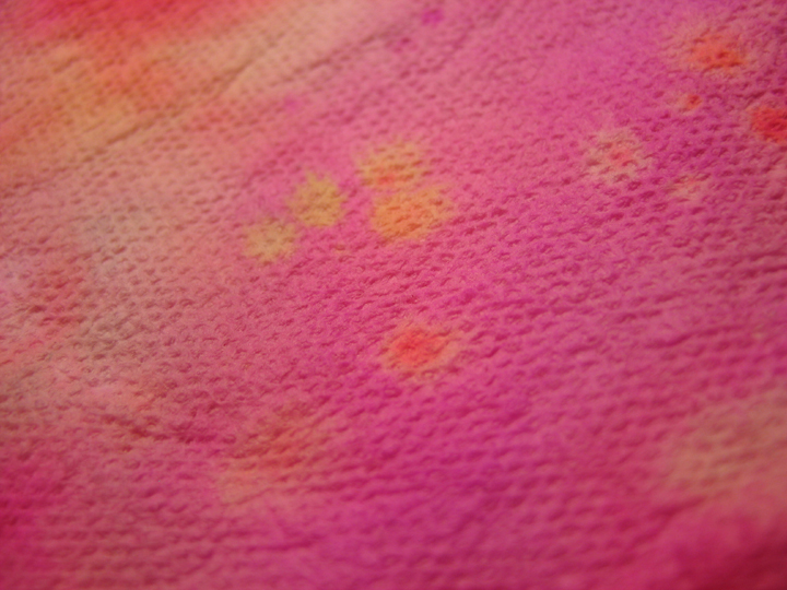
While I was flipping sheets and rearranging them so that they would dry more fully, I noticed lots of little details on many of the sheets. I wasn't really even looking for them, but even with (or maybe because of) the massive integration of the different pigments, a bunch of places where the colors did curious things formed. Of the few that I specifically noted, I particularly liked this one.
1) I allowed the watercolors to soak out of the brush-tips semi-randomly by wrapping the paper around and around the brush-tip and letting it sit with a weight (a bottle of gesso) on it for a few seconds or so. The towel paper is pretty efficient at sucking the pigment out of the pen so you don't want to leave it too long. You can see that I also added a blue line to one of the two sheets in a much more intentional effort. Also, for the two sheets that I worked on, I selected different pallets of pigment to use and the pens I chose for each are shown here with the "finished" sheets.
Once the pages were inked up, I wanted to transfer the pigment from sheet to sheet, spread it around on the sheets that I inked and also increase the number of sheets that I had to work with. There were places where the pigment was so heavy that it was obviously wet to the touch. To make this happen, I stacked two clean sheets of paper towel at the bottom, then one of the colored sheets, then three clean sheets, then the other colored sheet and finally two clean sheets at the top. Based on the results that you'll see below, I wish I'd placed more clean sheets, especially between the two.
At this point I moved from my paper-craft table downstairs to the kitchen counter upstairs since I'd be using water and leaving my work to dry under a ceiling fan. I wasn't sure about how (or how much) to wet the stack of towels but I was pretty sure that I didn't want to just run them under the faucet. I opted for a spray-bottle as the applicator. (And a pizza box to protect the counter -- but I should have put down newsprint instead of being lazy, now we have a bit of pink to our counter.)
I started out gingerly spritzing water onto the top. But a stack of nine paper towels is pretty absorbent and after going crazy with the sprayer for a while I discovered by pulling up a few sheets to look for saturation that it was all kind of floating at the top of the stack. This is what the top looked like after I was done with just spritzing the water. The problem with deciding that it needs more water is that the water-storage capacity of modern paper towels is astounding. Maybe I should have sprayed a bit on each towel as I layed them on the stack or something.
I ended up taking the lid of the sprayer and just pouring water onto the stack. And I got quite a bit too much, I think. I noted above that I wished I'd included more clean towels; that might still be good, but really, I should have used less water. Next time I'll pour it on more gradually and let it soak in before pouring the next bit on and try to reach a saturation without a soak. This is what the top looked like after I was done applying water.
So, once I had the stack soaking, I still noted that the migration of the pigments through the substrate was pretty minimal. And while there were some nice color combination blotchy areas, there was a bunch of plain white paper towel. As skeptical as one might be of using paper towels as an art medium anyway, plain white even makes me cringe. So I rolled the whole stack up thinking I could just knead the colors around -- which turned out to be correct.
The problem with kneading the colors around, at least in part, is that there was all that water trapped in the paper. When I squeezed, huge gushes of water would spill from the roll, carrying the pigment with it. You can see the mess that it was making below (but y'know, at least a mess of nicely colored paper towels is something I can use) where I was working. The real problem with all this water flow becomes evident when you note that after this step there is much less in the way of discrete color blotches. They've all bled together. Which is fine, but kind of less pretty than, especially, that first shot I took of the roll before I started squeezing. Again, less water next time.
So, after wringing the roll of towels out a bit, I unrolled them and picked them apart to spread and dry. All of the above-depicted work was done in half an hour on the evening of 01 Feb 2008 but these last two shots and some final drying are from the early morning of 02 Feb. You can see what I mean about the blotches bleeding together. I'm still not totally complaining about the effect, but more discrete colors might be nice too.
While I was flipping sheets and rearranging them so that they would dry more fully, I noticed lots of little details on many of the sheets. I wasn't really even looking for them, but even with (or maybe because of) the massive integration of the different pigments, a bunch of places where the colors did curious things formed. Of the few that I specifically noted, I particularly liked this one.
16 January 2008
So, like my last entry, I'm using this as a reminder and an announcement of something I'm going to do. Last time it was read and comment. This time, I'm planning to participate in Thing-a-day-2. Each and every day of February will see me taking a few minutes to an hour to mindfully create something. Anything! They'll be suggesting weekly themes and I'll maybe take those into consideration. Stuff that I might make on any given day: artist trading card, valentine, birthday card, photo-documentary, software, etc.
So, I need to keep this fresh in my mind so that come 21 Jan, I remember to register.
18 December 2007
Christmas Cards
So this year Cathy and I decided to send out cards. I have this bad habit of wanting to send out Christmas cards and thus buying a couple boxes and then doing nothing about it. This year was going to be different! But Cathy and I have been doing paper-art/craft -- collage, cards, ATCs, etc. It's a loads-of-fun craft that you can get into for only a few hundred dollars. So we decided to hand-make all the cards this time. (Note to self: start making cards for next year in April -- it turns from a fun pass-time to quite a chore when deadlines loom.)
In the end, we got all the family and friends on our list, but it was a close thing. So maybe next year we'll start earlier and make more!
Anyway, I wanted to show off the cards and maybe talk about their crafting a bit. If nothing else it's a good excuse to document these things we made and practice at blogging. Maybe the recipients of the cards will see this and enjoy their mention.
These cards are appearing here in the order in which Cathy scanned them for me, not the order in which we made them.
I'm also inserting Cathy's comments in purple
At the time when I was starting this card, we had already finished the first few and I was wondering about making some with richer, darker surfaces than those that were coming naturally to us. So I picked this 'handmade' paper out of our collection and cut it down to an abnormal size and started thinking about how to capitalize on that surface while retaining a festive holiday spirit. I couldn't get a white ink from stamps to work on the textural surface and embossing was distorting the flatness too much. So I went with stickers, which I made with a Xyron Create-a-Sticker 150 from some snowflakes that were punched out of a flecked hand-made paper and vellum as well as some silver sequins.
Because this was the only card Chris made that wasn’t made on a card blank, he had to create an envelope for it. There are templates available for that sort of thing, but he merely folded a large piece of paper in such a way that it made an envelope. It was clever, but a little bulky.
The Snowflake card went to Adam Banning -- a friend of the family who was especially in our hearts and thoughts this season.
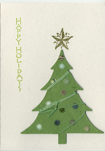
When we were shopping for card blanks, Cathy picked out some of these window cards. Somewhere along the way we also got a pack of these large, thick cardboard Xmas-tree embellishments. Cathy was envisioning the way we see Christmas trees through front windows all the time when she worked up the design for this card. She also selected the elegant silver stickers that adorn the tree and card and made use of the Happy Holidays stamp that I bought. Another good thing about this project is that I had taught myself how to use grommets on a couple of ATCs I made but Cathy hadn't picked up the skill. So with a little coaching and practice, you can see that she's now an old hand. For some reason, I can't think in terms of ribbon (even if I like buying extra-wide, particularly richly-surfaced stuff), but Cathy does. It worked great on this one. I really like how the silver stickers appear as ornaments on the tree and snowflakes on the frame and tie the two sections together with the common motif.
I really like ribbon cards, but I worry about how well they will go through the USPS. We had them hand canceled, but the postal lady told me that they still go through the machines. Hopefully it made it through the post without being too crushed.
The window/tree card went to Cathy's aunt Cathy in Texas.
This card was pretty obviously designed as a wrapped present. We found some lovely Japanese papers at Paper Depot in Minneapolis but because it was pretty spendy, Cathy selected only a few sheets. The background of this card is from one of those. She actually had several card ideas based on cards that look like presents but this one is the only one that was given life. I think the ribbon was also purchased at Paper Depot, but I'm not sure if she had in mind this construction or was just buying it knowing it would be a useful element. As I look through paper-art magazines and websites, I see tons of pieces using tags as elements. Like birds in dunce-caps, it's a thing right now. I have to admit that I generally don't see the appeal. But the currency of the trend means that tags are ubiquitous at craft shops. Cathy picked up this small pack of colored tags for uses like this. I have to say that a gift-tag on a present is actually a pretty reasonable use and the snowflakes and pine help steer the package from a kind of spring-like wrap toward a more wintery theme.
One problem that cropped up and is something that I've struggled with in a few ATCs is burying stuff on the back of the card. Cathy's ribbon goes into and behind the front panel of what was a folded card. She decided to just glue it shut as a laminate -- turning it into a flat card and handily hiding away the back of the ribbon. But it got kind of rumply and the grommet creates a hard-point on the rear. It's still very pretty, but if you're handling it, it feels less than perfect.
The present went to Cathy's uncle Jim in NYC.
When we started this, we thought we'd be working together on more of the cards. We create pretty well together, and as it turned out we did provide huge card-altering feedback all through the process, but there are relatively few cards that we both touched creatively. This is one of them.
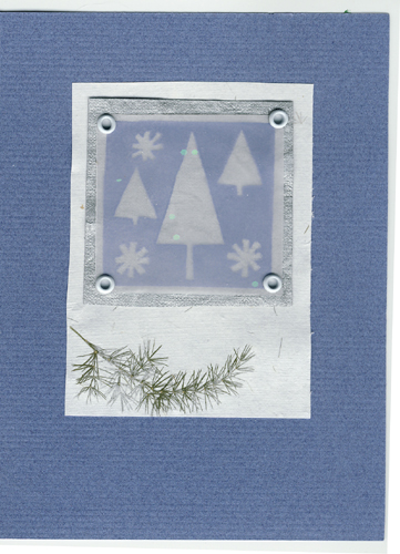
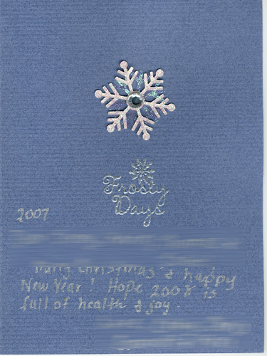
I was stamping those negative Christmas tree impressions on that sparkled vellum using a cheap foam stamp from Michaels -- playing with ideas and trying to make elements for an entirely different concept -- one that died on the vine. And the stamped vellum was sitting around on our workspace for a few days. We both agreed that they were nice and should be useful for something but it took a while for Cathy to put together the design that worked. The blue pigment that I used on the vellum worked nicely with the blue cardstock and the silver text reflects the vellum's base color which keeps the design tight.
An issue arose with this card when over time the vellum curled up and away from the card's surface. It looked nice when it was pressed to the card (or when it was lying flat, at first) but not as much when it puffed up. So Cathy and I played with ways to tack it down and ended up settling on just another couple of grommets between the top and bottom icon. It leaves things a little unbalanced but we didn't have a great alternative and still looks nice. I really like the subtlety of design that this piece presents including the interior continuation of the theme.
I love it when we can collaborate on a card. Mostly, we just made our cards individually, in whatever style of theme struck our fancy. But I really liked some of Chris’s experiments with stamping on vellum, and decided they’d make a nice card. I’m not happy with the way the vellum split at the corners where the grommets were. I wonder how to fix?
This card went to Cathy's cousin Bob.
We had a couple of cards done at this point, including the six-panel raised tree piece and the messy melange of multi-color 'Happy Holidays' cards below. And I liked both of those so I was experimenting with a sort of combination. It's a very simple design but I like how obviously home-made it is without having any flaws, per se. I stamped the text nine times knowing that I was going to put four or five hand-cut trees over it -- wanting be sure that the message was clear enough even though individual instances of the stamp would be significantly obscured. I then cut out six or so trees from various appropriately textured and colored papers and shifted them around until I liked the layout. I used those thick adhesive foam pieces to make sure the trees stand off the surface to give it a pleasing dimensionality. And that's all there was to it.
I think this might be one of my favorites that Chris made. One thing he’s better at than I am, is making chaotic elements look good together. This tends to make the cards look more spontaneous and less formal.
(Please note that she's better at formality and order than me. We're complimentary that way.)
This card went to our friends Teresa and Patrick Tebbe (Garrett's other parents).
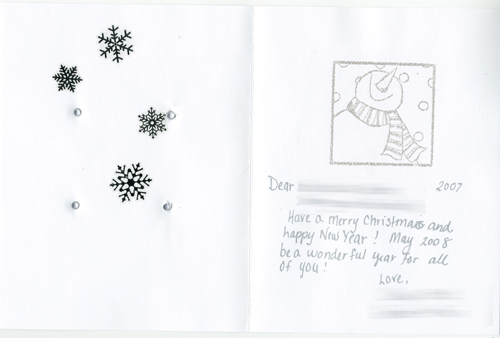
Cathy picked out this snowman stamp and used it on a couple cards. It was interesting playing with it as an element with other bits and pieces and background cardstocks coming up with appropriately pleasing combinations. The snowflakes are from a set we bought online and especially embossed in silver on this blue card, they look quite elegant. Note that the snowman 'cartoon' square isn't centered along either dimension. Cathy shifted it around above the snowflakes looking for the right spot and settled on this obviously non-centered location that showcases the right amount of the snowflakes. The snowflake motif is continued on the interior, too.
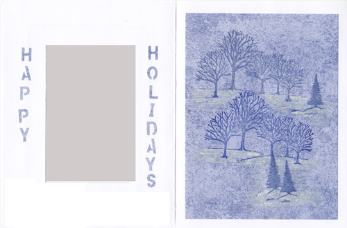
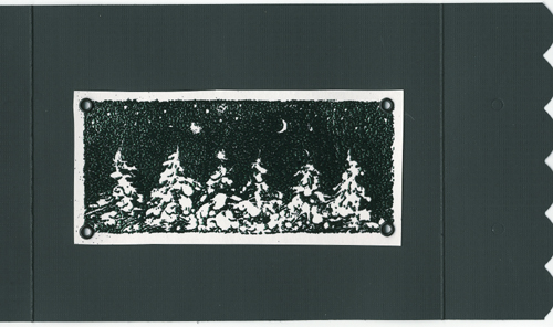
One of our early ideas -- championed most strongly by Cathy was to develop a list of Seasonal quotes or phrases to include as design elements on the cards. This one has a Thoreau quote that's quite nice and evocative of winter. If I'm recalling correctly -- this was one of the very first cards, Cathy had a hard time getting that stamp to work well and have the appearance of snowy woods. We have scraps on our work table from failed attempts. In the end, she nailed it. On the interior of the window side, "HAPPY HOLIDAYS" is punched out of the same paper as the scenery and glued in place.
I had to practice the lettering on the front 3 times on scrap paper before I got the size and spacing right. I’m so used to typing these days, that my hand was sore from all the hand writing. I then hand painted white pearlescent paint on the stamped image, to get it to look snowy, and I used white glitter modge podge to give it a sparkle (that doesn’t show up in the picture). This card went to a family friend Gloria Banning, who, like her son, was especially in our thoughts these holidays.
I picked up these sparkly trees (I think) at Hobby Lobby in Mankato and wanted to use a small series of them on a simple design. I also had some nice textured card stock that I wanted to use and was really digging some cards in books, magazines and web pages that were using strong gold in Xmas designs. I really like how this turned out. Simplicity is often a great attribute. The middle tree is glued flat to the card and the two side trees are floating on adhesive foam bits. The interior reflects the design with the layered card, but not the trees.
It’s amazing how simple, elegant elements can make for a nice card.
This card went to my Grandmother.
We bought some odd cards like the textured red stock in the one above and these almost black tri-gate-fold cards. Black is funny to work with. Cathy made this card. I love the outside design and also the inside but I dont think they particularly reflect one another. (I secretly think that Cathy was looking for excuses to use new stamps that we bought for the Christmas card project. ;-)
I was worried about using black for a Christmas card – it’s not exactly a traditional color, and I worried that people would think we were in mourning or something. In the end, this was one of my favorites.
This card went to our dear friend, Paul.

These two cards were made for Cathy's brothers, Paul and Sean who are young men now with their own addresses and everything. I like the layering and her use of grommets instead of adhesive. There's a bit of ripple to the paper -- one could call it a fault, but I like to see signs of a thing being hand-made. I think the gold stampwork, even after the embossing kind of falls down a little. Maybe it should have been dark black ink with gold embossing powder.
I was trying for an Asian-themed card. The red and gold paper is another Japanese paper, and the stamps have that simplicity of style. However, these fell kind of short in my opinion. The stamping/embossing didn’t have the amount of contrast that it should have to show up properly. They were pretty, but not as effective as I would have liked.
I think this is my favorite of our cards. Cathy made it fairly early on. I think it was based on a card from a book, but loosely. It's just sweet -- six little trees on their backgrounds, obviously hand-cut, overlapping the background squares. They're raised off the surface of the card to provide depth. I guess if I were looking to say something critical, the lower right tree doesn't contrast well with the background, but the pattern does a substantial job of correcting that. The inside is nicer than most of our interior pieces too, so this card is a big win all around.
As Chris mentioned, I based this loosely on a card I saw in a cardmaking magazine (actually it was a valentine card, with 6 hearts). Mine looks substantially different, and I embellished it differently, but in the end, this is by far my favorite. Here’s something odd: The card was mailed at the same time as the red cards to my brothers, went to the same address, but took 2 days longer to arrive. How weird is that?
The six trees went to Cathy's parents.
here I am trying to combine heavy-handed gold with other elements. I really like rough edges too. The gold pieces are torn using one of those Fiskars(?) rough-edged tear bars. the problem is that they ended up kind of more regular than I'd wanted. but I went with it because the nature of the edge was so nice. The orangy-red pieces were measured to be roughly the same size and then just torn by hand. I like that effect better and will do more of it in the future. I dragged the edges of those six pieces across green and gold ink-pads to reflect other colors used in the composition. The green Xmas-tree background was my fifth or sixth attempt at finding the right setting and I'm pretty pleased with it. I chose the tree stamp for a silly little stamp set that we found because it was the right size and was a tree -- reflecting the background trees.
Chris really struggled with this one. He played with combinations and arrangements of papers, and nothing looked right. So he set it aside a few days, came back to it, and turned out this – and I think it turned out nicely. Sometimes taking a break is the best thing to do when you get stuck.
This card went to my parents.
I like this card way more than I like the scan of it. There is torn vellum that provides a dimensionality to the snow-flake surface when you're holding it in person. You can see a bit of it if you look closely, but it's much nicer in person. Again, you see the snowman that Cathy has a thing for. :) The snowflake grommets are funny. Cathy and I independently picked some out as a great embelishment to have. We ended up picking up the ones I selected because half were bare aluminum and half were white and maybe in two styles. The snow-man and -flake motifs are repeated on the interior.
I painted the snow on the snowman with white ink from an inkpad. I then painted on glittery modge podge, and while it was still wet, sprinkled on fine white glitter. I stamped white snowflakes on the torn vellum (you can barely see them in the scan). The only thing holding the vellum on, are the grommets on the snowman, so it’s allowed curl away from the card a fair amount. This is one of my favorites.
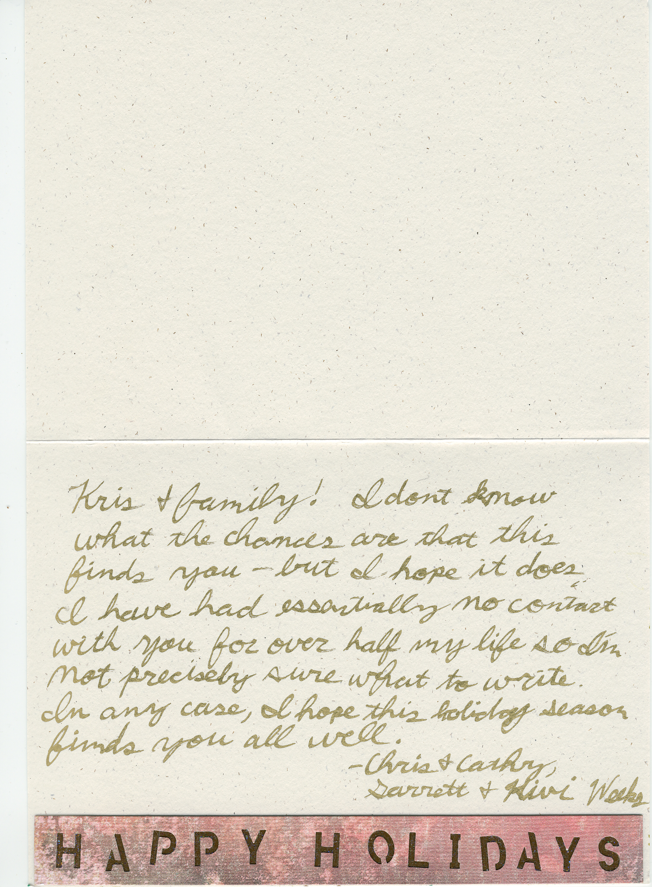
My art has a history of messiness. I like it. My clay is rough and textural and I love complex surface. So here's me doing that kind of thing with stamping. There are about eight pigments in there that I did over three days, letting them dry -- sometimes with heat, sometimes without, between applications. I kept the stamp vaguely vertical so that there wouldn't form too much of a jumble and I think it worked to keep the message quite clear. The interior has "HAPPY HOLIDAYS" spelled out along the bottom in a strip of paper by punching the letters out and another decorative paper showing through. The scan of it that we have is crazily large, but here it is.
Chris had a tough time getting the interior of this card to work with the exterior. The cover is a nice jumble, but the inside needed to be neater, to leave us a place to write.
This card went to my Aunt Kris -- if her last known address happens to be current.
Actually, Cathy made this while I was at work at the last minute and I didn't see it in person.
I played with a stamping technique where you use water-color markers and draw directly onto the stamp. It allows a great deal of control where the colors go on the stamp. I used heat to dry it, which caused the paper to rumple. I wish it had stayed smooth.
This card went to our friend Larry Chong.
Actually, Cathy made this while I was at work at the last minute and I didn't see it in person.
I played with layering multiple colors of reddish ink to get a sunset-like/northern-lights like effect, and I’m pleased with the effect.
This went to our friends Nick and Diane Sauer.
This card was frustrating. I love the base stamp that I used -- applied twice across the long card to create a wide stand of woods. But...then what? I wanted it to be snowy, so I used a Versamakr pen and this two-tone iradescent embossing powder but that didn't do it. I layered on some more: white and clear, trying to build up a snowy layer. Ultimately I wasn't satisfied with the effect. The card hung around for a couple weeks with me on the edge of throwing it out. But I really like to make stuff work and sometimes over-working it can actually make the card. I added silver sticker snow flakes and liked the effect. Then I used a couple of stickers from a scrapping kit that Cathy had for ages. Then I stamped a few trees on and touched them up with some watercolors. in the end, it's not high art, but I'm reasonably happy with it. And I can always fall back on having put more effort into it than any of the others. :)
This card was an interesting one. I love that tree stamp – it really looks like the trees along the interstate in Northern Minnesota, and we picked it to show people the beauty we see every day. However, it was tough to know what to do with it when we did use it. This is probably my least favorite of Chris’s cards, but I am pleased with the depth he captured in the end.
In the end, we got all the family and friends on our list, but it was a close thing. So maybe next year we'll start earlier and make more!
Anyway, I wanted to show off the cards and maybe talk about their crafting a bit. If nothing else it's a good excuse to document these things we made and practice at blogging. Maybe the recipients of the cards will see this and enjoy their mention.
These cards are appearing here in the order in which Cathy scanned them for me, not the order in which we made them.
I'm also inserting Cathy's comments in purple
Because this was the only card Chris made that wasn’t made on a card blank, he had to create an envelope for it. There are templates available for that sort of thing, but he merely folded a large piece of paper in such a way that it made an envelope. It was clever, but a little bulky.
The Snowflake card went to Adam Banning -- a friend of the family who was especially in our hearts and thoughts this season.
I really like ribbon cards, but I worry about how well they will go through the USPS. We had them hand canceled, but the postal lady told me that they still go through the machines. Hopefully it made it through the post without being too crushed.
The window/tree card went to Cathy's aunt Cathy in Texas.
One problem that cropped up and is something that I've struggled with in a few ATCs is burying stuff on the back of the card. Cathy's ribbon goes into and behind the front panel of what was a folded card. She decided to just glue it shut as a laminate -- turning it into a flat card and handily hiding away the back of the ribbon. But it got kind of rumply and the grommet creates a hard-point on the rear. It's still very pretty, but if you're handling it, it feels less than perfect.
The present went to Cathy's uncle Jim in NYC.
I was stamping those negative Christmas tree impressions on that sparkled vellum using a cheap foam stamp from Michaels -- playing with ideas and trying to make elements for an entirely different concept -- one that died on the vine. And the stamped vellum was sitting around on our workspace for a few days. We both agreed that they were nice and should be useful for something but it took a while for Cathy to put together the design that worked. The blue pigment that I used on the vellum worked nicely with the blue cardstock and the silver text reflects the vellum's base color which keeps the design tight.
An issue arose with this card when over time the vellum curled up and away from the card's surface. It looked nice when it was pressed to the card (or when it was lying flat, at first) but not as much when it puffed up. So Cathy and I played with ways to tack it down and ended up settling on just another couple of grommets between the top and bottom icon. It leaves things a little unbalanced but we didn't have a great alternative and still looks nice. I really like the subtlety of design that this piece presents including the interior continuation of the theme.
I love it when we can collaborate on a card. Mostly, we just made our cards individually, in whatever style of theme struck our fancy. But I really liked some of Chris’s experiments with stamping on vellum, and decided they’d make a nice card. I’m not happy with the way the vellum split at the corners where the grommets were. I wonder how to fix?
This card went to Cathy's cousin Bob.
I think this might be one of my favorites that Chris made. One thing he’s better at than I am, is making chaotic elements look good together. This tends to make the cards look more spontaneous and less formal.
(Please note that she's better at formality and order than me. We're complimentary that way.)
This card went to our friends Teresa and Patrick Tebbe (Garrett's other parents).
I had to practice the lettering on the front 3 times on scrap paper before I got the size and spacing right. I’m so used to typing these days, that my hand was sore from all the hand writing. I then hand painted white pearlescent paint on the stamped image, to get it to look snowy, and I used white glitter modge podge to give it a sparkle (that doesn’t show up in the picture). This card went to a family friend Gloria Banning, who, like her son, was especially in our thoughts these holidays.
It’s amazing how simple, elegant elements can make for a nice card.
This card went to my Grandmother.
I was worried about using black for a Christmas card – it’s not exactly a traditional color, and I worried that people would think we were in mourning or something. In the end, this was one of my favorites.
This card went to our dear friend, Paul.
I was trying for an Asian-themed card. The red and gold paper is another Japanese paper, and the stamps have that simplicity of style. However, these fell kind of short in my opinion. The stamping/embossing didn’t have the amount of contrast that it should have to show up properly. They were pretty, but not as effective as I would have liked.
As Chris mentioned, I based this loosely on a card I saw in a cardmaking magazine (actually it was a valentine card, with 6 hearts). Mine looks substantially different, and I embellished it differently, but in the end, this is by far my favorite. Here’s something odd: The card was mailed at the same time as the red cards to my brothers, went to the same address, but took 2 days longer to arrive. How weird is that?
The six trees went to Cathy's parents.
Chris really struggled with this one. He played with combinations and arrangements of papers, and nothing looked right. So he set it aside a few days, came back to it, and turned out this – and I think it turned out nicely. Sometimes taking a break is the best thing to do when you get stuck.
This card went to my parents.
I painted the snow on the snowman with white ink from an inkpad. I then painted on glittery modge podge, and while it was still wet, sprinkled on fine white glitter. I stamped white snowflakes on the torn vellum (you can barely see them in the scan). The only thing holding the vellum on, are the grommets on the snowman, so it’s allowed curl away from the card a fair amount. This is one of my favorites.
Chris had a tough time getting the interior of this card to work with the exterior. The cover is a nice jumble, but the inside needed to be neater, to leave us a place to write.
This card went to my Aunt Kris -- if her last known address happens to be current.
I played with a stamping technique where you use water-color markers and draw directly onto the stamp. It allows a great deal of control where the colors go on the stamp. I used heat to dry it, which caused the paper to rumple. I wish it had stayed smooth.
This card went to our friend Larry Chong.
I played with layering multiple colors of reddish ink to get a sunset-like/northern-lights like effect, and I’m pleased with the effect.
This went to our friends Nick and Diane Sauer.
This card was an interesting one. I love that tree stamp – it really looks like the trees along the interstate in Northern Minnesota, and we picked it to show people the beauty we see every day. However, it was tough to know what to do with it when we did use it. This is probably my least favorite of Chris’s cards, but I am pleased with the depth he captured in the end.
Happy holidays!
Subscribe to:
Posts (Atom)